When I was mingling at the ATypI Conference Gala last Saturday night it struck me how many happy faces I saw. At first I thought it was more related to the good company of like-minded type geeks – and food and drinks of course. But when I asked people like Verena Gerlach, Dan Reynolds, Nina Stössinger (fellow Typophile who presented the upcoming first Armenian-Latin FontFont she co-designed with Hrant Papazian) and others, they told me it was because they simply thought the conference was so damn good. And I agree – although there always will be the unhappy few who nag, I too had the feeling that ATypI Dublin was a very successful event, on multiple levels.
A funny thing is that usually when attendees comment on a conference a lot of attention goes to anything but the presentations. What exactly stirs conference-goers?

Dublin Castle. Photo by Richard Rutter
Accommodation
Understandably one's enjoyment of a conference is influenced by its location. The impressive buildings and surroundings Dublin Castle proved to be the perfect setting, with the Conference Centre just the right size for the attendance. Although the rooms for both Track A and B were adequate, due to the unexpected success of specific presentations the smaller room was overcrowded on at least two occasions. I do think one of those occurrences could have been avoided by moving Thomas Phinney's exposé Foundries and the business of web fonts to Track A. We've known for more than a year that the hot topic of web font business keeps attracting large audiences (see also Ivo Gabrowitsch's Goodbye Tristesse! Hello Web Fonts! at TYPO Berlin 2010: Passion), so it was no surprise Track B was bursting at the seams.

Catherine Dixon and Phil Baines: Cultural crossroads: lettering for the Pozza Palace, Dubrovnik. Photo by Jean François Porchez
Technology
Of course you have to sit comfortably and be able to see an hear everything well to appreciate the presentations. Despite some minor glitches the acoustics and sound amplification as well as the projections were fine. It was not as impressive as TYPO Berlin, but they mustn't be compared as the latter is an event of a completely different magnitude with a much larger budget. In the main hall on Track A a second screen displayed video capture of the speaker. Because the image was almost exactly the same size and angle as the view from the room I don't quite see what the added value was – unless recordings of the presentations will be used later on.
Food
Strangely enough one of the most often recurring topics with regards to conferences is the catering. In a way it makes sense – if you eat well, you are comfortable and feel good, so you're predisposed to have a more positive attitude towards the overall experience. The ATypI Dublin organisers chose not to go for local cuisine and hired The Silk Road Café, located in the Chester Beatty Library, also in Dublin Castle. Together with his team of Arabic chefs Abraham Phelan creates Middle Eastern, North African, Mediterranean and vegetarian dishes. The website explains "[t]he focus in each dish is home cooking using only the freshest ingredients and following halal rules". As I love Arabian food I was delighted to find amongst others Moroccan and Lebanese dishes on the menu, down to the typical pastries accompanying the coffee and tea.

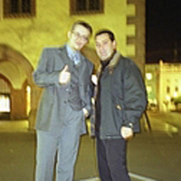
Nina C Stössinger and Hrant Papazian at the National Print Museum reception. Photo by Jean François Porchez
Social events
Crucial to the appeal of conferences is the opportunity to meet friends old and new, and the networking possibilities they present. As the typographic community is quite dispersed globally these events are the few times we all gather in one physical location. These are also the rare occasions when everyone speaks the same language – we can unashamedly talk about type and typography without the eyes of our interlocutors glazing over. One of the highlights for me was finally meeting in the flesh a number of people who I've known online, for almost eight years in the case of Hrant Papazian.
Besides coffee breaks in between the presentations, the social events are ideal to (re)connect with people. Because I didn't attend unofficial opening of the conference: the opening of Verena Gerlach's show Paradox Alg(i)er(s) at The Factory Space gallery. However the main conference opening reception on the official opening on Thursday evening gave us non-PreFace attendees a second chance.

ATypI crowd enjoying the National Print Museum. Photo by Richard Rutter
On Friday night I joined the trip to the National Print Museum. Situated in the old Garrison Chapel of Beggars Bush Barracks, it is home to a fascinating collection of artefacts and objects relating to printing history. More than just a guided tour, the visit provided the opportunity to have a go at hand setting and printing metal type, as well as seeing numerous setting machines and printing presses in action. It was a great experience, and with so many different things happening at once I often didn't know where to look first. An additional advantage of visiting the museum with 70-odd type people was that we had a number of impromptu guides graciously dispensing their knowledge. Oh, and the refreshments in the museum entrance hall were delicious – yup, food again. ; )
ATypI conference gala after dinner party at Odessa. Photo by Marina Chaccur
The customary conference gala on Saturday night took place on the top floor of the Guinness Storehouse, a massive building constructed in the style of the Chicago school of architecture. Originally built in 1904 to house the Guinness fermentation process, since November 2000 it is one of Dublin's tourist attractions. The Irish themed buffet dinner was very nice, and being all together in one place mingling and chatting away was even nicer. As there was no after dinner party scheduled, we reconvened at the Odessa club later on. We partied until 2:30, when the exasperated DJ finally had to shout "I can't help it: it's the law!" to stop the crowd from going on. It's the law? Sheesh, here we can party until the sun rises, and then some.

Catherine Dixon points out a very nice 4 at the Dublin Lettering Walk. Photo by Timothy Donaldson
Dublin Lettering Walk
For me, one of the absolute highlights of the conference was Phil Baines' and Catherine Dixon's Dublin Lettering Walk. If you're interested in the origin of these walks; the one written up by Phil Baines for his graphic design students for the 1997 Reading ATypI conference spawned the Public Lettering website. I attended my first one at ATypI 2006 Lisbon: Typographic Journeys. I was very impressed by the considerable knowledge and mastery of the subject by Phil Baines, and the wit with which he conveys both the substantial and the anecdotal to his audience is delightful. Since I had to leave halfway at ATypI 2007 Brighton: Handson to catch my train back to Belgium, this year I decided to add another day to my Dublin stay, just for the walk. Again it was a great experience, discovering lettering treats – no, it's not type ; ) – ranging from large commercial lettering to almost faded painted words while strolling through the Dublin city centre. Check the ATypI Dublin 2010 Group Pool on Flickr; it has many photographs of the walk.
Next post I will talk a bit about the presentations. Promise.
Header image:ATypI 2010 Dublin: The Word, Track A. Photo by Marina Chaccur