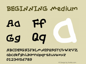
As you may very well know I often rail against poor typographic choices for movie posters and credit title sequences. However it could be even worse, and after seeing the remix video If Movies Had Crappy Fonts I feel like such a snob. Jest – the latest website under the CollegeHumor Media umbrella – asks if using the wrong typeface in the opening titles can ruin an entire movie. Find out for yourself with this Jest original re-imagining the beginning of famous films like Star Wars, The Dark Knight Rises, Drive, and more… with crappy typography. Make sure you wait for the pay-off.

